Need
Professional introduction for an interior designer and founder.
CASE STUDY · CORPORATE IDENTITY
An interior designer needed a business card that felt modern, direct and memorable while making it easier for potential clients to start a conversation instantly.
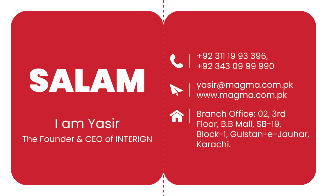
The pain point was simple: traditional business cards often become passive pieces of paper. For an interior design professional, the card needed to communicate personality and make contact frictionless.
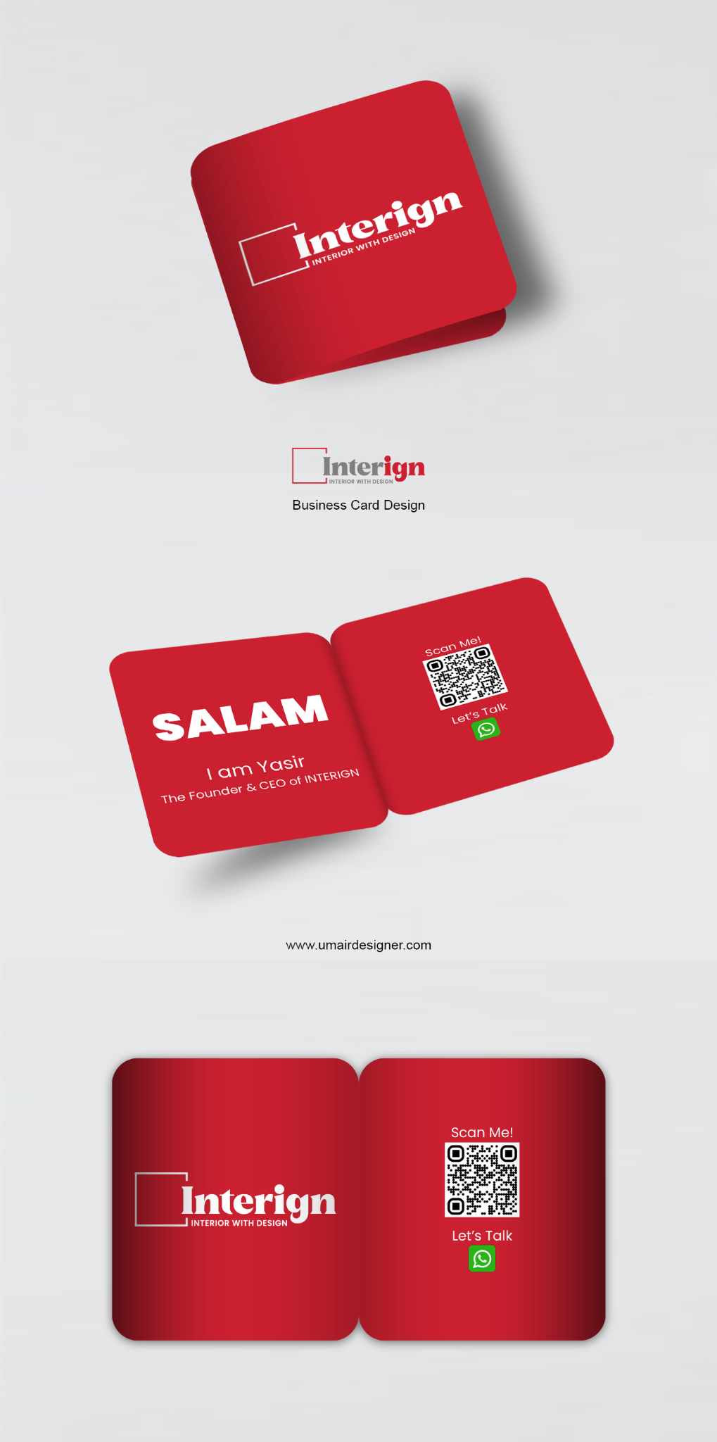
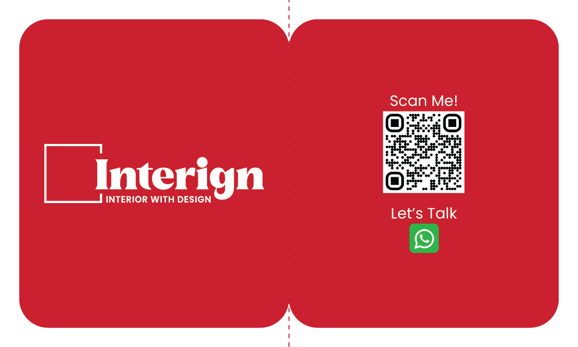
I used a bold red identity, minimal copy and a prominent QR-to-WhatsApp interaction. The result turns the card from a contact detail carrier into a conversation starter, then extends the same visual logic into stationery.
BUSINESS CARD SYSTEM
Move the mouse across each visual for a subtle dimensional response.
STATIONERY EXTENSION
A clean stationery application keeps the red/grey identity consistent across formal communication.
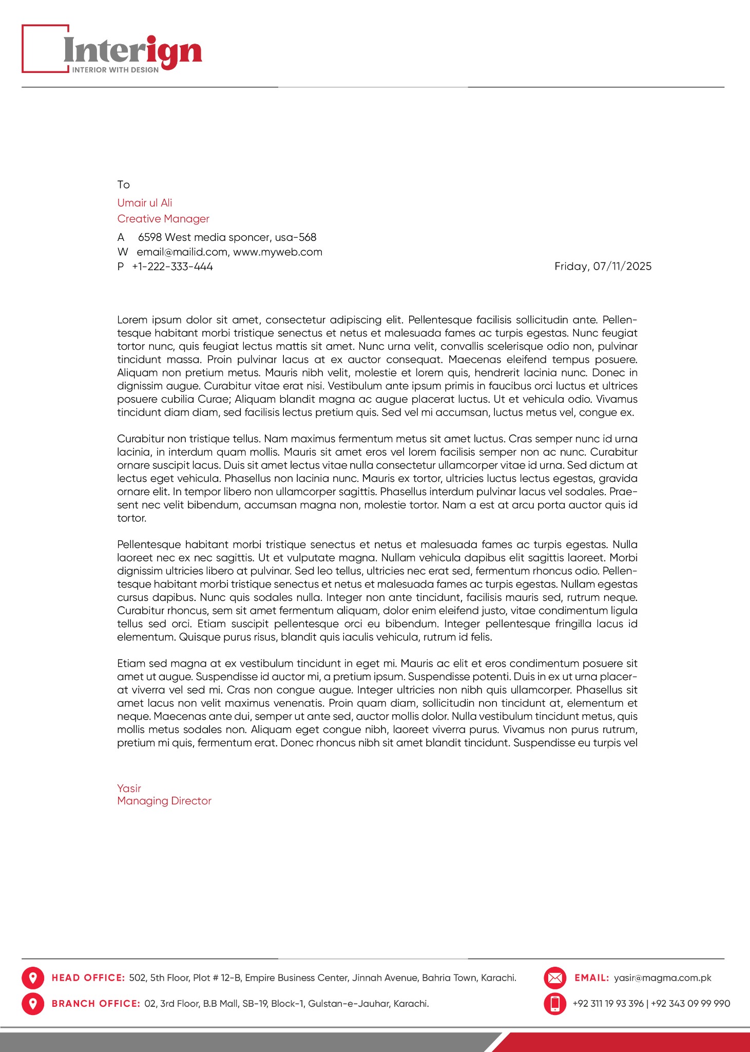
The letterhead extends the red and grey brand language into everyday business communication. A disciplined header, clear information hierarchy and structured footer make the identity practical, not ornamental.
Professional introduction for an interior designer and founder.
Bold two-sided card with clean hierarchy, QR-driven contact action and supporting stationery.
A more useful, memorable identity touchpoint designed for real networking situations and brand consistency.