Hierarchy
Clear product names, notes and supporting information guide the reader without competing for attention.
CASE STUDY · EDITORIAL DESIGN
An A4 catalogue system designed to present a premium fragrance range with stronger hierarchy, richer product storytelling and a luxury Middle Eastern visual language.
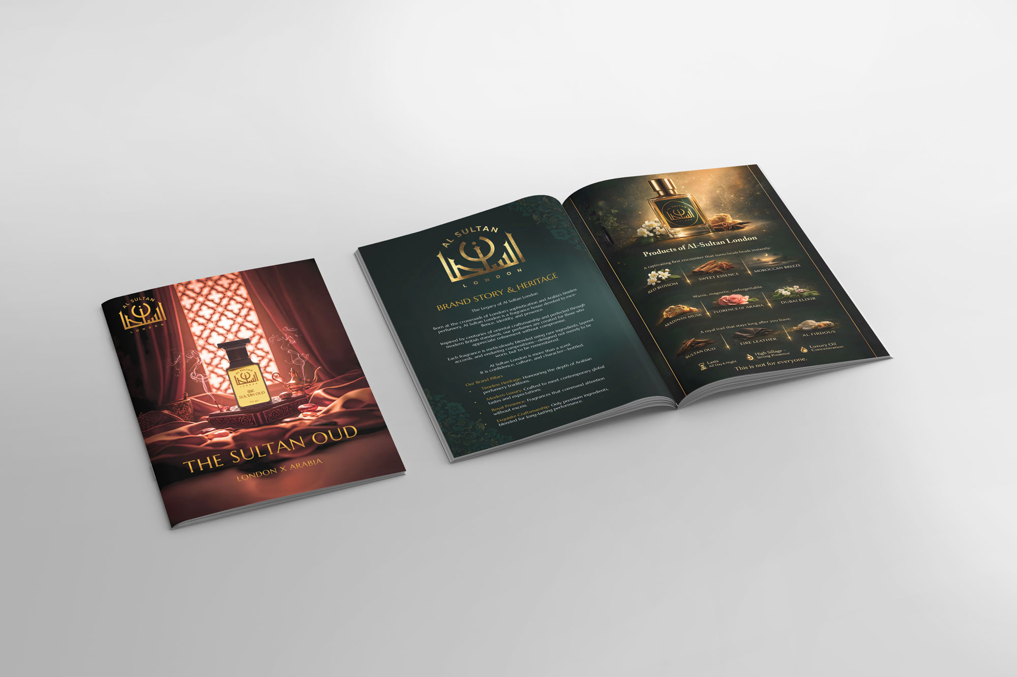
The catalogue needed to feel premium while carrying multiple fragrances, notes, product details and brand storytelling. The challenge was to avoid a cluttered brochure feel and create a consistent editorial rhythm across every spread.
I built a reusable layout system with controlled typography, dark premium backgrounds, gold accents, product-led compositions and enough variation to keep each fragrance distinctive.
FULL CATALOGUE
Move your mouse across the catalogue. The artwork responds with a subtle perspective shift while staying fully readable at maximum width.
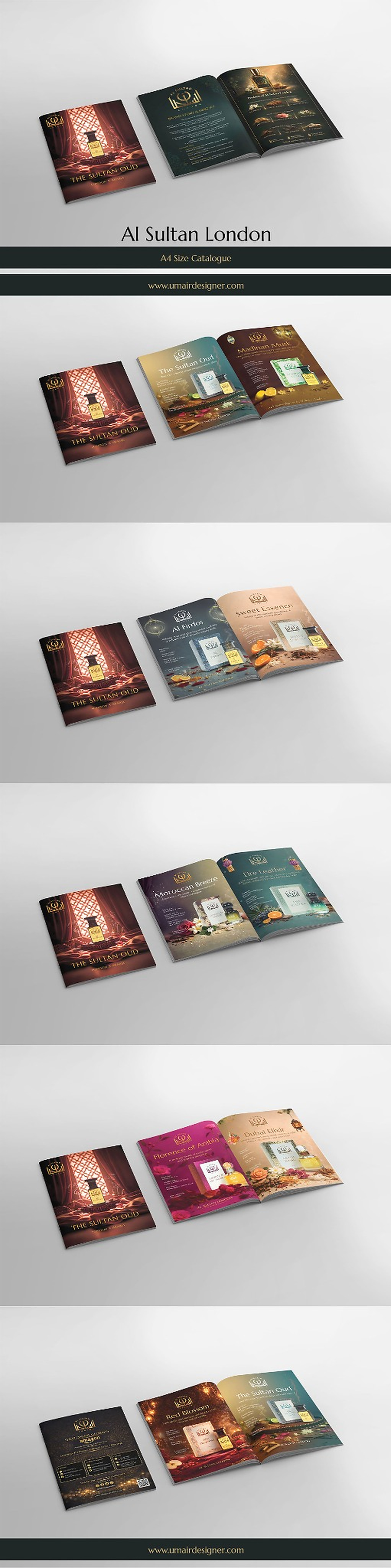
Clear product names, notes and supporting information guide the reader without competing for attention.
A modular grid keeps the full catalogue visually unified even when colors, ingredients and imagery change.
Dark tones, gold detailing and product-centric composition position the range with stronger perceived value.